Analyzing results
lemlab comes with a variety of preconfigured plots that allow a first analysis. Additionally it is possible to create your own plots and display them in the lemlab format.
Using the analysis toolbox
All plotting capabilities are bundled in scenario_analyzer.py. The file contains two classes. ScenarioAnalyzer contains all functions to plot various aspects of a scenario to get a deep insight into the results. ScenarioPlotter is the configuration class for lemlab, which gives all plots the same uniform look. It can also be used to create additional plots by the user and still maintain the same look.
The example code to run the analyzer can be found in the code examples in rts_8_plot_results.py for real-time and in sim_4_plot_results.py for non-real-time simulations. Both files first create an instance of the scenario analyzer by providing the path of the simulation results that are to be observed. Additional arguments specify whether the figures should be shown directly in the IDE and if they are to be saved as png-files in the subfolder analyzer of the provided scenario. The command run_analysis() calls all analysis functions within the ScenarioAnalyzer class, which will be explained in detail below. All functions can also be called separately by using their respective name.
sim_4_plot_results.py:
import lemlab

if __name__ == "__main__":
    sim_name = "test_sim"

    analysis = lemlab.ScenarioAnalyzer(path_results=f"../simulation_results/{sim_name}",
                                       show_figures=True,
                                       save_figures=True)
    analysis.run_analysis()
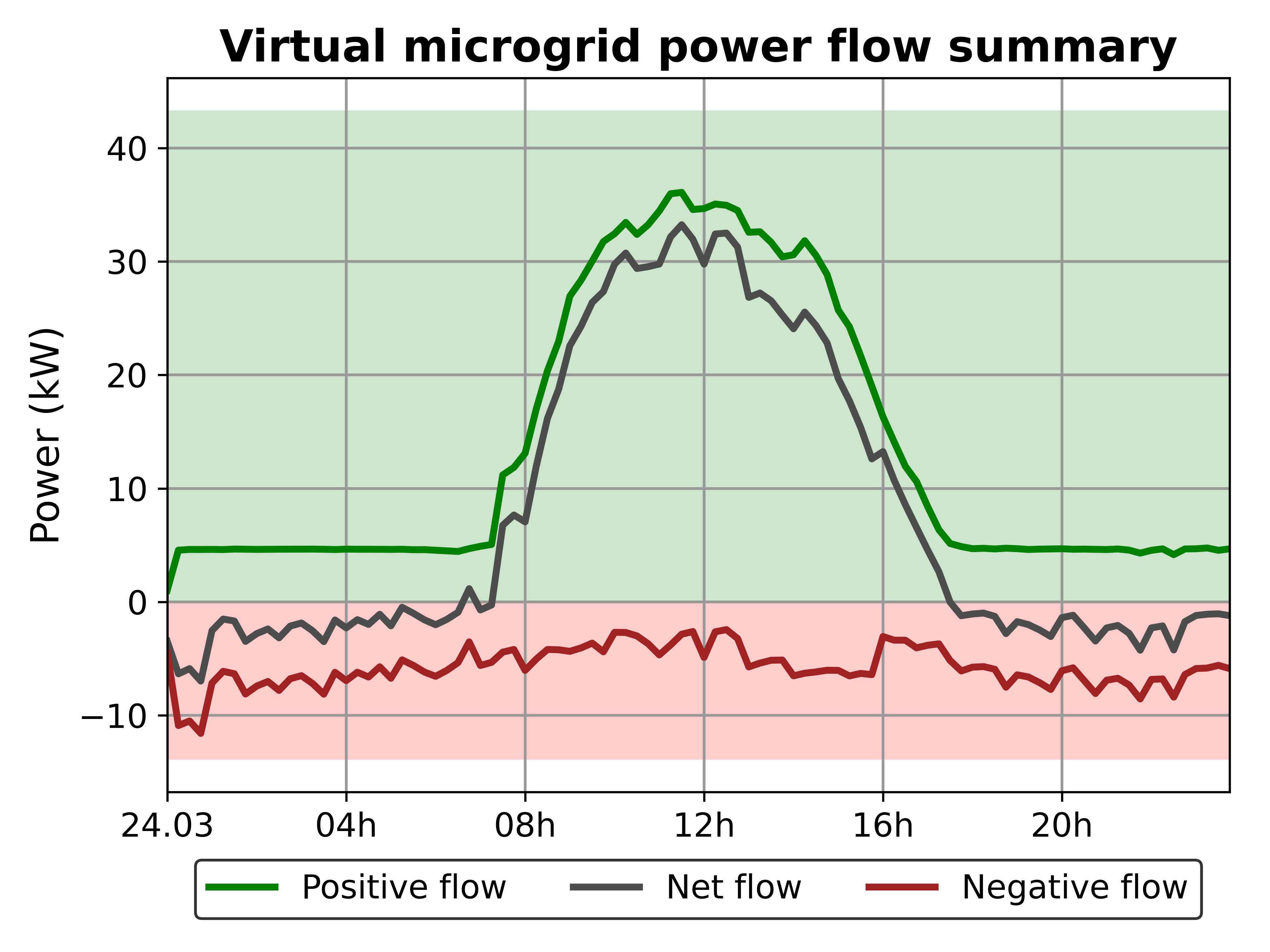
Virtual feeder flow
plot_virtual_feeder_flow()
The plot shows the virtual power flow within the microgrid for the entire simulation period. The flow is split into the negative flow, which represents all loads that are present in the grid and the positive flow, which sums all local generation within the microgrid. The difference between the two is the net flow and represents the power that is either drawn from the higher level grid during times of higher demand than production or fed into the grid vice-versa.
The function requires no input to create the plot.
Market clearing price
plot_mcp(type_market)
The plot contains the clearing price for every time step of the simulation. It both contains the individual results in green and the weighted average in red. The more vivid the green circles of the individual results are the more bid-offers matches were cleared at that price.
The plot has one optional argument type_market, which can be used to specify which of the simulated market is to be plotted. If no argument is specified, the first type of market is displayed as it is the main market. For further information about the types of market, see lem and the example config files.

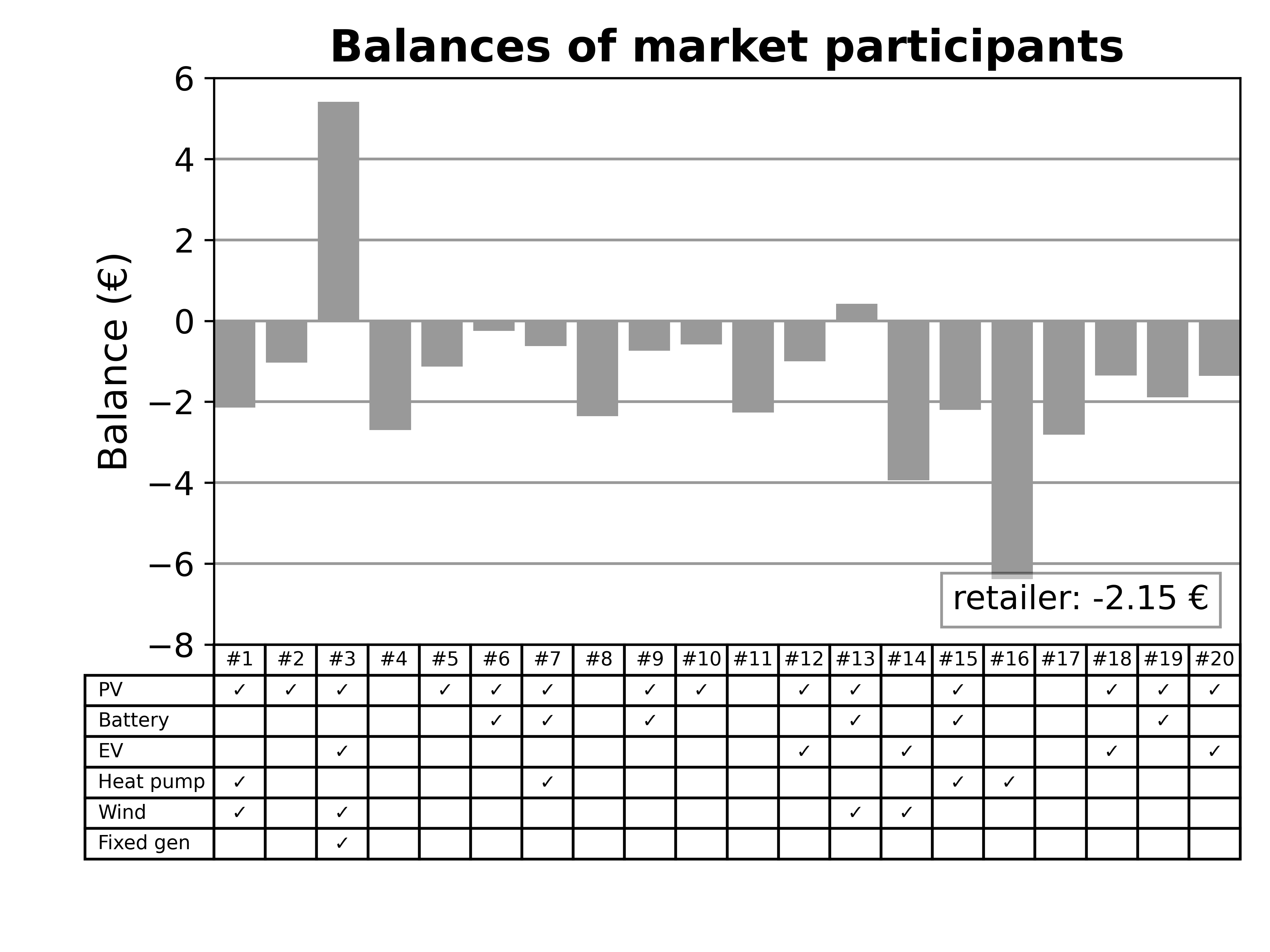
Market balances
plot_balance()
The plot shows the market balances of each market participant for the entire simulation period. The supplier’s balance is displayed in the bottom corner. The balances of the prosumers are shown as bars alongside the information, which types of devices they own. If the balance is positive, it means that the prosumers earned money during this period while they spent money, if the balance is negative. Positive balances can occur, for example, when a prosumer has as a PV plant and battery.
The function requires no input to create the plot.
Price versus quality
plot_price_quality(type_market)
The plot displays the weighted market clearing price over the simulation period as well as the share of different qualities in the microgrid. In the below figure these are local and green & local energy.
The plot has one optional argument type_market, which can be used to specify which of the simulated market is to be plotted. If no argument is specified, the first type of market is displayed as it is the main market. For further information about the types of market, see lem and the example config files.

Household plots
plot_household(type_household, id_user)
The household plots offer further insight into the individual prosumers. The first plot shows the power profile of the respective prosumer. It shows the individual consumers and generators as well as the power flow through the main meter. The second plot shows the corresponding balance for every time step of the simulation. The balance is split into revenue and fixed and varying costs. The fixed costs contain both the levies as well as balance costs while the varying costs are the costs for purchasing electricity on the market.
The function has two optional arguments type_household and id_user to allow to plot specific prosumers. type_household requires a tuple of 5 boolean values. Each boolean value represents the presence/lack (1/0) of one type of device. The order is the following (PV, Battery, EV, Heat pump, Fixed generation). For example, (1, 0, 1, 0, 0) means that a prosumer with a PV plant and an EV is to be plotted. The advantage for the user is that the function will automatically check if such a prosumer exists. If that is the case, it will be plotted, otherwise the prosumer with the most devices will be plotted. The second optional argument id_user allows the user to specify which exact user is to be plotted. The value can either be inserted as integer if numeric values are used as user IDs or otherwise as string.
.png)
.png)
Costs per type prosumer
plot_balance_per_type(all_types)
To be done once the exact information is decided on.
Creating your own plots
The scenario analyzer merely serves as first start into the analysis of created scenarios. Depending on the topic to be investigated, additional plots are required to fully understand the market’s behavior under the given setup. Naturally, these plots can also be created outside of the lemlab environment. All simulation results are found in the subfolder scenario_results under the scenario name. However, it is also possible to create the new plots in the lemlab design.
To create your own plot within the lemlab environment you can include it as function in the class ScenarioAnalyzer, however, this is not mandatory. Regardless of whether you want to include it or not the workflow is the same. After extracting the data to be analyzed an instance of the ScenarioPlotter needs to be created. This will call lemlab’s style and create a figure and axes object. Graphs are to be added to the axes object (e.g. ax.plot() or ax.scatter()). Once all plots were added figure_setup is called to provide the additional figure information such as the title.
figure_setup:
figure_setup(title, xlabel, ylabel, ylabel_right, legend_labels, xlims, xticks_style)
All parameters of figure_setup are optional. The specific instructions on how to use the function can be found in the code. Here only a few parameters will be discussed. ylabel_right is only to be used if two y-axes exist. xlims specifies the range in which to plot. xticks_style specifies the style of the x-ticks. The available styles are “numeric” and “date”. If no style is provided there are no x-ticks added to the x-axis. Afterwards, the plot can be displayed using matplotlib:
matplotlib.pyplot.show()
If you want to save the figure, it is possible to use the built-in function __save_figure() of the class ScenarioAnalyzer as long as the plot is created within ScenarioAnalyzer.